34 Results:
September 2, 2019

September 2, 2019
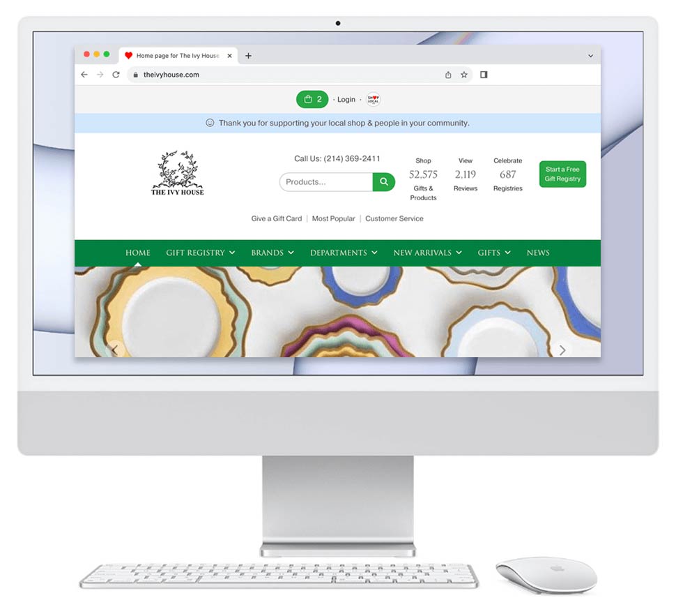
We compared a competitor's registry page size to a Bridge registry's page size. Bridge's site was just 1/3 the file size. Bridge's registry was 2 MBs compared to the competitor's page size of 5.9 MBs. Why does this matter? The competitor's site was 300% larger, and thereby may have taken 300% longer to load for a bride, her family, and friends.
Bridge's registry even had more products on it than the ...
Read More
February 15, 2019

February 15, 2019
February 9, 2018

February 9, 2018
What if there was a way for stores to save $8,900?
If they could, stores could spend that on inventory instead.
We'll share how stores can save:
If one uses Shopify (a popular e-commerce platform) to make an e-commerce site, the store often signs up for a lot of recurring costs. In comparison, when a store signs up for Bridge, there are no fees.
Shopify
In the first year, the store may pay $6,000+ for using Shopify:
+ $79/month for Shopify general service (plan that offers a gift card).
+ $75/month ...
Read More
October 31, 2017

October 31, 2017
Diane’s monthly strategy articles are give your indie store free tips and tricks to compete online. View Post
June 6, 2017

June 6, 2017
Roof = your website’s page title & meta data. Very important. No two 'roofs' should be alike.
Signage = branding.
Front door = easy navigation on each page for quick access.
Display window = large pictures of products that you’re selling.
Store hours in the window = your website’s listing of ways to contact you, preferably on each page.
Road = ...
Read More
February 4, 2017

February 4, 2017
Shopify Could Be Called 'Nickle and Dime-ify'
Recently, two business friends told me to check out Shopify. They said they were using it to manage online stores. Since my company Bridge offers e-commerce software to 200+ retailers, I was curious to see how Shopify compared.
I signed up for an account as if I were a retailer.
I thought the sign up process was pretty easy. They didn't even ask me for a password. They automatically gave me one that I could change later.
I then set ...
Read More
January 5, 2017

January 5, 2017
From the NY Times, Thursday Jan.5, 2017
Start-Ups Hope Couples Say ‘I Do’ to Online Wedding Planning
Read the full story below, or share it. http://nyti.ms/2j4wMxL
Planning a wedding remains a largely traditional pursuit. For many couples, it is a frustrating months long project that requires sifting through masses of details and costs on venues, services and products. Now, a variety of start-ups are trying to cut down on that information overload by harnessing new technologies to capture a slice ...
Read More
March 2, 2016

March 2, 2016
Your Physical Store vs. Your Online Store:
- Sidewalk = small websites and blogs that lead to your website, such as local newspaper sites, local community groups, a bride’s gift registry that links to your store. These sites provide: foot traffic.
- Road = major websites that lead to your website, such as Facebook, the New York Times site, etc. These sites provide:
Read More
June 11, 2015

June 11, 2015
Social media explained.
bridge ~ i'm buying or selling a donut
ha ha View Post
December 31, 2009
December 31, 2009
Click on the following comparison:
Haviland's Gold Colette pattern page:
https://www.mottahedeh.com/brands/r-haviland-c-parlon/filter/color/gold/pattern/colette.html
LCR West Hartford's Gold Colette pattern page:
http://www.lcrcollection.com/results.cfm?bID=98&patid=83&brand=Robert%20Haviland
Read More
November 11, 2009

November 11, 2009
Mottahedeh recently hired me to redesign its website. Please find a sample design above.
The parent company Mottahedeh, Inc. distributes Mottahedeh, R. Haviland & C. Parlon, and Milestone. I designed the new site to show the three brands with equal footing, and make it easy to navigate to each.
In the attached comparison, I show the enhancements I made over the original.
Currently, the new home page is 'live,' with subsections coming as they are ready...
Read More
August 2, 2009

August 2, 2009
Results page:
Shopping cart page:
Please click on the images above. They show the comparison of our clients website before and after we redesigned their retail home goods website. View Post
May 10, 2009

May 10, 2009
We are working on this design for a home goods company. The current website is at left; our proposed updated design is on the right. Notes about the design:
- I updated logo to be clean, contemporary, and fresh.
- I put the hyperlinks to the categories and the brands directly on the home page. This is good for ranking well in Google.
- I was sure to put lots of smiling faces on the home page, and in the top banner. This builds trust with shoppers.
- The phone number ...
Read More
December 18, 2007
December 18, 2007
James Surowiecki in this week's The New Yorker offers some insights into how buyers shop–thereby helping us serve this audience. He writes:
In an experiment in the early nineteen-nineties, people were first asked whether they preferred a $110 microwave oven made by Emerson or a $180 oven made by Panasonic. Only forty-three per cent chose the Panasonic. But when a higher-priced Panasonic model, costing $200, was introduced into the mix, ...
Read More