13 Reasons Why 600 Indie Stores Beat Saks Fifth Avenue

13 Reasons Why 600 Indie Stores Beat Saks Fifth Avenue
Saks Fifth Avenue just launched a new website. Since more than 600 stores rely on Bridge Store to power their websites, I decided to compare the new site, which likely cost millions of dollars, to an indie retailer's Bridge Store software. An indie store pays pennies compared to Saks' millions, so the Saks site must be a million times better, right?After a careful review, I'm happy to share that our indie stores have the better website. And, it sort of 'saks' for Saks that it spent millions on a site that misses key points. Saks has 45 locations, but our little mom-and-pop retailers, often with just one location, outshine it.
For my comparison, I used these two pages:
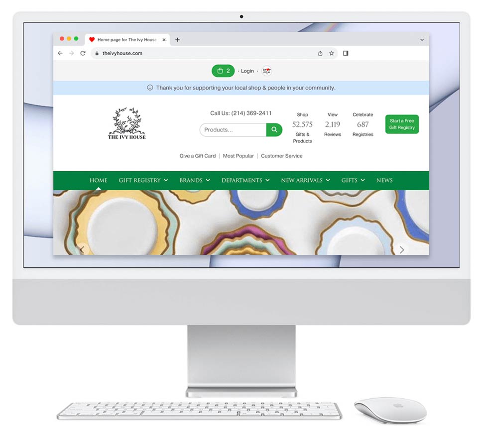
The Ivy House in Dallas, Texas:
https://theivyhouse.bridgecatalog.com/details.cfm/Waterford?pattern=10817&ProdID=374719
Saks Fifth Avenue:
https://www.saksfifthavenue.com/product/waterford-lismore-diamond-essence-set-of-two-wine-glasses-0400013268913.html
Here are 13 reasons why Bridge's retail software beats the Saks software:
Bridge Store:
1. Shows the brand's logo
As we know, brands spend millions of dollars to build their brand. Brands are the legacy and reason a consumer often buys a product. Saks new site does not show the Waterford logo.
2. Shows the dimensions
Since customers can't hold the item on the screen, it's crucial the web page quickly and clearly show the dimensions and capacity. Bridge Store shows the dimensions under the product name. Saks does not. Customers should not have to click a link to see dimensions or capacity.
3. Makes the price easy to see
There is nothing worse than having to search a page or squint for the price. Note: most shoppers for high-end goods are in their 50s or 60s and often wear eyeglasses. Bridge Store clearly shows the price in a nice, easy to read font. Saks' price font is small.
4. Makes viewing the next related item easy
When looking at a product, your inclination is to want to see a similar item next. Bridge Store makes this easy by showing a "Next" item in the upper right of the product area. On Saks, there simply is no next product. There are other items you may like, but no next product.
5. Makes viewing products from the same collection easy
When looking at product from a collection from a brand, you understandably want to be able to see all items from that collection. Bridge Store offers you a link to see all items from the Lismore Diamond Essence collection. Saks does not allow you to do this. This is a big design oversight by Saks.
6. Gives a clear call to action to buy the product
Bridge Store's 'Add to Shopping Bag' and 'Add to Registry' buttons are green. Green is the international color for 'go' and move forward. Saks' button is black. If one were to excuse its size, it would be hard to tell it's a link.
7. Makes it easy to know what content is a hyperlink
Bridge Store links are often blue. Blue is the universal color for a hyperlink, and customers are more likely to click blue link. This is why blue is the color used by Google. Saks uses black for links and it's hard to tell what is a link. This is hurting a customer's ability to get information and make purchases.
8. Allows customers to like products
Bridge Store has a like button for each item. This allows Bridge to more easily show customers what they like, as well as do data analysis to see what items appeal to customers. Saks does not allow a customer to like the item shown, but oddly allows them to like the suggested items shown below it.
9. Allow customers to share products
Bridge allows customers to share products via email and on Facebook. Saks does not.
10. Helps customers learn more about a product
Bridge Store displays the product description by default. Saks' site hides important information behind drop downs that one must click.
11. Explains why the customer should pick the store vs another store
Bridge Store shares four reasons to buy from the indie store. Saks does not make a case why the customer should pick Saks.
12. Makes it intuitive to add items to a shopping bag
Things need to make sense. When there is a quantity of '1' in the shopping bag, you do not need a minus sign to remove content. Reason: people do not want to add '0' to their shopping bag. Bridge Store anticipates this. We gray out the minus sign when there is one item in the shopping bag.
13. Makes it easy to call the store
The biggest design mistake that companies make is not displaying the telephone number. Have you ever visited a website, had a question, but the site didn't display the telephone number? It can drive the shopper crazy. Bridge Store shows the store phone number at the top of product pages. Saks does not.
I invite Saks to put its products in Bridge Store and then compare on which site a customer purchases more: its million dollar site or its Bridge Store.
How can we further test whether Bridge Store beat Saks? Bridge Store continually ranks higher than national retailers like Saks when one searches for a brand in Google. Customers visit Bridge Stores, find what they want more easily, and Google knows this. Therefore, it ranks our retailers using Bridge Store higher.
Tags:
Saks Fifth Avenue
View Post on Shop Local