47 Results:
March 17, 2017

March 17, 2017
February 14, 2017

February 14, 2017
Read More
May 11, 2016

May 11, 2016
April 2, 2016
April 2, 2016
Check out our StoreFront on The Knot! Also a place where you can add reviews of your Registry experience here.
Read More
April 10, 2014

April 10, 2014
“Spring is nature's way of saying, 'Let's party!”
? Robin Williams, Weapons of Self Destruction
We couldn't agree more! (especially after this past winter)
Remember to like us on our social media sites if you haven't already. We post regularly about our products and ideas we love. You may even see us share your posts from time to time.
Here is our latest update and as always, please let us know how we can be of service to you.
Q Squared is redefining what
...
? Robin Williams, Weapons of Self Destruction
We couldn't agree more! (especially after this past winter)
Remember to like us on our social media sites if you haven't already. We post regularly about our products and ideas we love. You may even see us share your posts from time to time.
Here is our latest update and as always, please let us know how we can be of service to you.
Q Squared is redefining what
Read More
November 19, 2009

November 19, 2009
I designed this website for Institutional Investor's Sovereign Funds organization.
I also designed promotional banners for the other locations on the roundtable tour. Each banner promoted a different event location. Other designs included: London, Coral Gables, and Singapore.
This relates to retail website design because it shows how you compose a website layout.
View Post
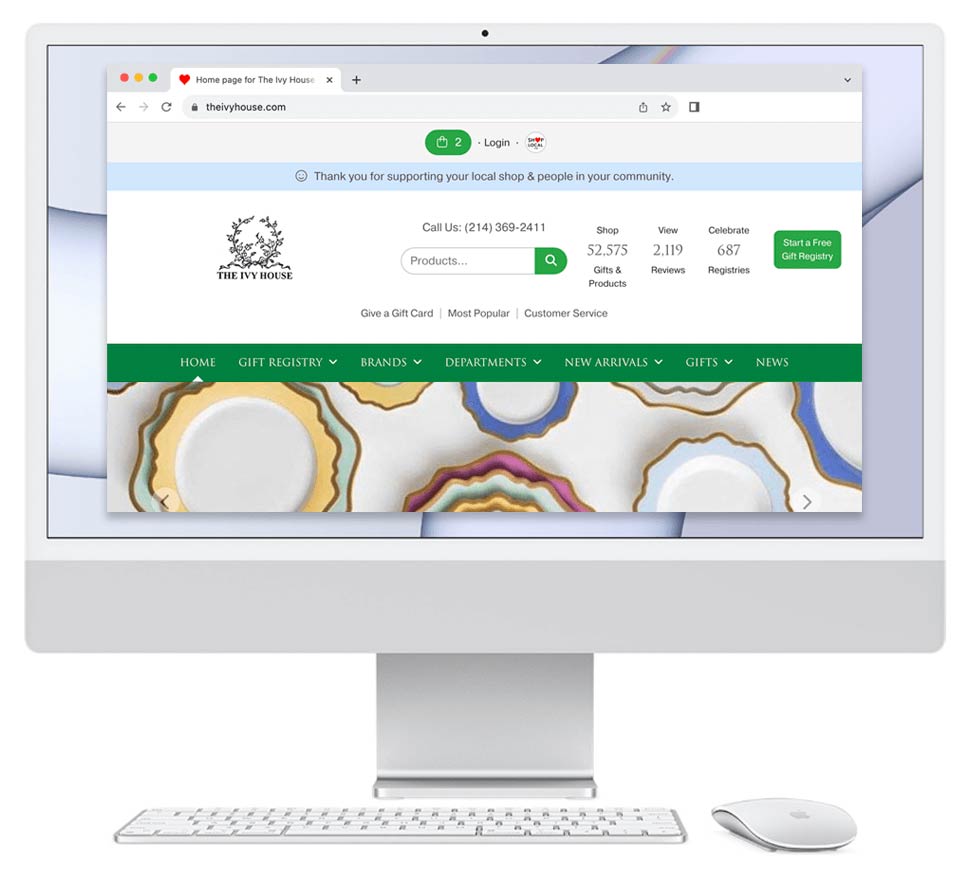
May 10, 2009

May 10, 2009
We are working on this design for a home goods company. The current website is at left; our proposed updated design is on the right. Notes about the design:
- I updated logo to be clean, contemporary, and fresh.
- I put the hyperlinks to the categories and the brands directly on the home page. This is good for ranking well in Google.
- I was sure to put lots of smiling faces on the home page, and in the top banner. This builds trust with shoppers.
- The phone number ...
Read More